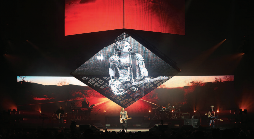
Photos: Todd Kaplan – Video is controlled using two Hippo Taiga+ units with a Notch Playback license
The project was something new for the designers. Lechterman says, “We had some ideas, some things we’d like to try out, but we were most interested in getting to know Keith better as an artist and as a person to develop a custom show for him.” As it turned out, Urban had ideas of his own. Gallagher says, “We talked to Keith about things that interested him, that got him excited, things he likes to do, that he doesn’t like to do, and things that have worked well in the past. We came up with five pages of notes and had a million different directions we could go in. Keith said, ‘I’d love to do a Nine Inch Nails show, but I don’t think my audience would like it.’ We had a good chuckle, but that really helped inform the overall aesthetic. We then began the process of distilling the five pages of notes over the next couple of months, turning them into a singular volume.” In the end, Urban decided he wanted something contemporary and, perhaps, unique for his fans. As Gallagher notes, “It was an exciting design challenge: how to give Keith a modern, edgy, moody, and brooding underbelly whilst still appealing to an audience who reveres him as a country star. The dichotomy there has led to some great results, and conflicts, over the course of the process.”
Early in the design, there was talk of doing a show with no lighting whatsoever. “The idea came directly from Keith,” Gallagher says. “We dug into it, seeing if we could accurately key-light him and the band with solely video products. In the end, we had to abandon the idea after showing Keith renderings of what the end result would be without lighting. However, the conversation certainly helped inform a video-driven design, which, ultimately, is what you see now.”
As the design process continued, “Keith asked for an immersive architecture of video, a simplistic cube, if you will,” Gallagher says. “What you see now is a tessellated version of that, with a moving ‘half-cube’ hung over the stage and an upstage wall that completes the box at one moment in the show. Two of the major video surfaces are automated, which brings a whole new dynamic to the staging. Once presented with renderings of this overall concept, it was ‘thumbs up,’ as long as we could fit it into the budget.”
Staging
The streamlined staging includes several risers owned by Urban. “It’s the Graffiti U Tour, so what is traditionally a B stage is shaped like the U in the album’s logo,” Gallagher says. “It is now called the U stage. For sheds, the U stage cantilevers out over seats near the lawn, to get Keith closer to the audience in the back.” The tour started in sheds and is now in arenas, where audiences have a different U stage experience. Gallagher says, “In sheds, no one gets up above the U stage, but, in arenas, in the upper bowl, when they’re looking straight down onto the U stage, it will look awesome. The arena crowd is going to see it in a way that none of the shed audiences ever really did.” In sheds, Omaha-based ACASS-Systems provided the U stage; for arenas, the Ustage is from TAIT, located in Lititz, Pennsylvania.
Video
“Video dominates the landscape, with content playing about 90% of the show,” Lechterman says. The stage features several video surfaces, consisting of Winvision Air 9, provided by the Los Angeles office of PRG. Upstage is a 12′-tall by 60′-wide wall that is convex at the center. At midstage is what has been termed the roof. “It’s a square video wall on four points that can lift up, come down, rotate, and do all sorts of things,” Gallagher notes. Completing the video screen component is a 20′-wide by 12′-high automated header. “It is basically the inverse of the upstage wall, so it is convex as opposed to concave,” Gallagher says. “All the video surfaces are blow-through, especially the header, which can act as a scrim when lowered to the stage floor.” Creation of the video portion of the production was not without some challenges, most notably the roof.
Read more here
